loading Skip to Main Content

Atmospheric Skies

Students will use Oil Pastels to depict atmospheric skies and create atmospheric perspective. Recommended for 4th Graders.

Elements of Art

Color: the visible range of reflected light.
Space: can be positive: the space an object occupies; or negative: the space around the object. It also refers to an illusion of depth on a 2-dimensional (height and width) surface, so that the scene appears to go back into space and real depth as used in sculpture.
Texturethe way a surface feels or appears to feel in a work of art.
Value: the lightness and darkness of a line, shape, or form; a measure of relative lightness and darkness.  One way to express this is the use of hues, shades and tints.

Principles of Design

Contrast: the arrangement of opposite elements, or using opposite qualities next to each other to create visual interest, excitement and drama.

Additional Vocabulary

Atmospheric Perspective:  the effect on the appearance of an object of the air/space between the object and the viewer: in the foreground, colors are warmer, more intense, more defined and values are darker; in the distance, the details of an object appear to decrease, colors appear cooler and less intense, and values lighten and fade.    
Background: the area of an artwork that appears farthest away on a picture plane, usually nearest the horizon.
Craftsmanship: A way of working that includes following directions, demonstrates neatness and the proper use of tools.
Foreground: the area of an artwork or field of vision, often at the bottom of a picture plane, which appears closest to the viewer.
Horizon Line: In a landscape, it’s the imaginary line where the land (or sea) meets the sky.
Hue: a color.
Middle ground:
 the area between the foreground and background of a landscape.
Muted: colors (or hue) with gray added.
Shade: color with black added. 
Silhouette: the dark shape or outline of something visible against a lighter background.
Tint: color (or hue) with white added.

Materials & Supplies

  • Class set oil pastels                                    
  • Class set 9”x12” white drawing paper 
  • Class set 9”x12” black construction paper     
  • Scrap paper for hue, shade & tint practice   
  • Class set glue sticks
  • Paper towels                                             
  • Images of atmospheric skies in many colors: photos and paintings
  • Atmospheric Perspective artwork examples from artists such as: Sharon Kingston, Claude Monet, JMW Turner, Shane Miller, Van Gogh

Context

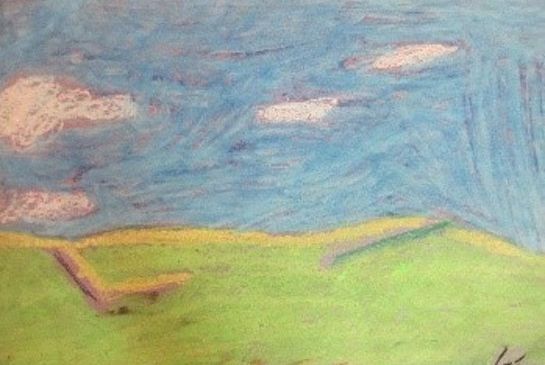
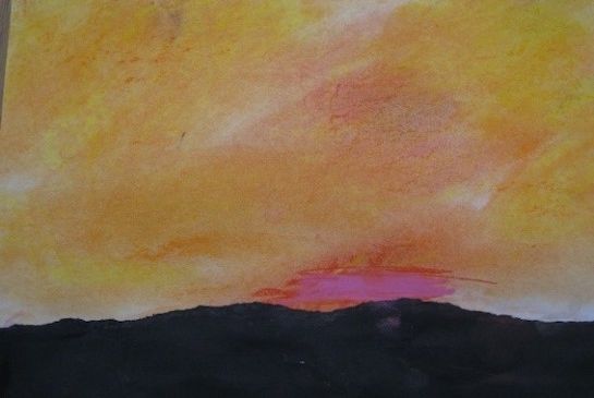
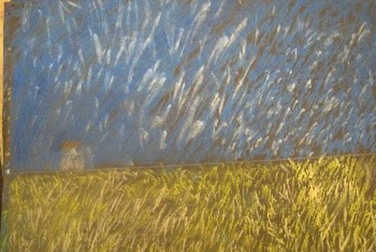
Atmospheric perspective is the technique of showing depth or distance by varying the hues, shades and tints and focusing on clouds, light and moisture in the sky. As things get farther away, their details become harder to see because the atmosphere affects what the eye can perceive. Edges look blurry and indistinct.

Advanced Preparation

Assemble at least 5 examples of atmospheric perspective landscape paintings and photos.
Make one or two examples of your own.
Locate good images/examples of atmospheric perspective. Photographs of mountain ranges often show this, also look for it in works from the following artists: Sharon Kingston, Claude Monet, JMW Turner, Shane Miller, Van Gogh. 

Tips & Tricks

  • Have students wash their hands before handling the black paper.
  • Go slowly when tearing the black paper.
  • Remind students that black oil pastels should be used at the end, if at all. They tend to overtake the whole color scheme, much like “too much pepper” can ruin a good flavor. Suggest trying gray or a different darker color first.
  • Thick erasers can remove a certain amount of oil pastel if needed.
  • Paper towels can help sensitive students hold the pastel and smudge by wrapping a piece over the fingers used. 

Discussion Points

Post above vocabulary words and define them. Refer to these words during the class.

  • Show the photos of atmospheric perspective. Ask students to locate the horizon. Remind them this is the background, the farthest point from the ‘viewer’ and suggests depth in a 3-dimensional space, even though the photo is 2-dimensional. 
  • Ask them if the sky is more than 1 color, what these colors are and is there a pattern where they change or get lighter or darker. (There may be a loose pattern as the light/moisture/ wind affects the clouds).
  • Show the paintings and compare/contrast. How are they the same? (they still suggest depth and atmospheric changes in the sky). How are they different? (The texture is created by brushstrokes and dabs of color). Talk about how brushes use small strokes and color blending to achieve the effect.

Reflection Point (Assessment of Learning Objectives)

Students will:

  • Observe ways that artists depict atmospheric skies
  • Use techniques to do the same
  • Create depth using drawing techniques
  • Use good craftsmanship

Instructions for Lesson

  1. Go over the art vocabulary definitions and the discussion points.
  2. With the paper in landscape orientation, demonstrate using a pencil to draw a light horizon line on the white drawing paper breaking it into ¾ sky and ¼ ground. Remind them that the line should be at or below the middle, to include more sky in the composition.
  3. Go through your oil pastel palette, looking for warm colors for sunsets, or cool colors for cloudy/blue skies. Be sure to include lighter tints as well as darker shades. Black isn’t always necessary to darken a color. Grays do a great job.
  4. Demonstrate putting down a hue and adding:
    1. White to create a tint.
    2. Gray to create a muted color.
    3. Black to create a shade.
  5. Students can practice this on scrap paper.
  6. Demonstrate blending from light to dark by removing the oil pastel label and hold it wide side down. Using a consistent direction and pressure, ‘build’ your atmosphere from lightest to darkest moving from the top of the page to the horizon.
    a. Background – tints
    b. Middle ground - hues
    c. Point out how the changes in value create the atmospheric effects.
    d. Heat from your thumb will soften and smudge certain areas where more blending is needed.
    e. Gently blend different colors into empty spaces.
    f. Try not to streak strong lines or fill the paper in completely.
    g. If areas look too dark, gently blend in lighter or white oil pastel. 
  7. Students start work on their landscape.
  8. Once the majority of them have either finished or gotten the hang of blending, stop them all to watch your next demonstration.
  9. Wash your hands in front of them, reminding them that soap cuts oil, water cuts soap. Now you can handle the black paper without leaving prints.
  10. Hold the black paper horizontally (Landscape Orientation).  Decide where to tear the paper based on how it fits your original drawn horizon line. Holding with both hands’ thumbs and forefingers pinching the edges slowly tear across the whole sheet. This is harder than it looks to get all the way across. If you go too fast you could lose control of the torn edge you need to simulate the mountains’ silhouette. It may take more than one paper to get this right, so have them tear it slowly to avoid that.
  11. Have them watch you add glue to the back of the black torn paper mountain range and line up its lower corners to the same corners of the white drawing paper they colored. 
  12. If they finish and want to do more.
    a. Repeat but without torn paper.
    b. Add details in the foreground only.

References and Attributions

Lesson written by Cynthia Moring. Additional resources found at https://www.sharonkingston.com/,  https://www.claude-monet.com/impression-sunrise.jsp, and https://www.william-turner.org/.

Notes for Educators

21st Century Thinking Skills
Thinking flexibly, taking responsible risks, reflecting, observing, making connections, visualizing, sequencing, comparing/contrasting, determining main idea, inferring, finding evidence, problem solving, cause and effect, decision making.

Washington State Learning Standards
(VA:Cr1.2.4) a. Collaboratively set goals and create artwork that is meaningful and has purpose to the makers.
(VA:Cr2.1.4) a. Explore and invent art-making techniques and approaches.
(VA:Cr2.2.4) a. When making works of art, utilize and care for materials, tools, and equipment in a manner that prevents danger to oneself and others.
(VA:Re7.2.4) a. Analyze components in visual imagery that convey messages.
(VA:Re8.1.4) a. Interpret art by referring to contextual information and analyzing relevant subject matter, characteristics of form, and use of media. 
(VA:Re9.1.4) a. Apply one set of criteria to evaluate more than one work of art. This happens if you discuss finished work, as a class.

Arts Integration Opportunities
Color/light theory: Students will learn how colors combine to make new colors. They will learn how light passes through opaque vs transparent objects.

Please note:  These lesson plans are intended for non-profit use only. Use of these plans for commercial purposes should give attribution to the Issaquah Schools Foundation and be accompanied by a nominal donation at www.isfdn.org/donate. Thank you.

Donate Now

Artistic Support Reference Materials

Loading...
Loading

Fueling Success for Every Student, Every School