Elements of Art
Hue: The pure color is generally referred to as “hue”. The value of a hue is adjusted by the addition of either pure black or pure white. Value is the measurement of the amount of black or white a pure hue has mixed.
Shade: A hue with black added to it. Produces a DARKER value.
Tint: A hue with white added to it. Produces a LIGHTER value.
Value: Also referred to as "tone". It is the darkness or lightness of a color and can be measured through the use of a value scale. Lighter values are referred to as "tints", while darker values are referred to as "shades". Value deals directly to light. We see things because light reflects off of objects and goes into our eyes. Our mind processes the light and rationalizes what we are seeing. Without light, we cannot see anything. In order to draw or paint in a way that creates an illusion of what we normally see, we must fully understand light and how it reacts on surfaces. Value is the key to the illusion of light.
Additional Vocabulary
Atmospheric Perspective: A technique of creating depth or distance in a painting by modifying the value/tone or hue and distinctness of objects perceived as receding into the picture plane. How the appearance of objects is altered over distance by the effects of the air between the viewer and the object. Adding white to a hue for objects in the background causes the effect of less distinction of objects by the eye. Adding black to hue for objects in the foreground creates contrast and therefore more distinction of the object by the eye.
Background: Objects appearing to be farthest from you in the piece.
Foreground: Objects appearing to be closest to you in the piece.
Midground: Objects appearing to be in the middle of the piece
Materials & Supplies:
- Pencil
- 110# Heavyweight Paper
- Acrylic Paint: White, Blue and/or Green, Black
- Paint Brushes (2 per student)
Advanced Preparation:
Allow time to shake paints well before the lesson. Each student should have their own set of paint pots or a palette in order to mix their own tints and shades. Each student will need two paint brushes. One for tints. One for hue and shades. Dispense small amount of white, hue colors. Dispense and hold back black paint pots.
Tips & Tricks:
- Decant a small amount of the white paint. You don’t need much to create the tints for sky and distant mountains/objects. You’ll need more of the hue color. Have students choose ONE HUE: blue or green. Warm colors are interesting as well but the cool ones look more natural. Give the black at the end so that students are not confused or introduce the shade too soon. Foreground should be all black or black with small amount of hue = very DARK shade.
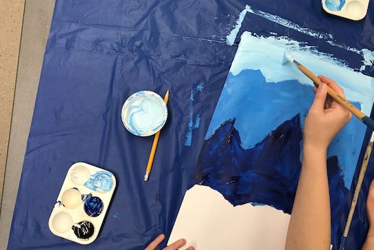
- Students will draw mountain ranges from the bottom of the paper up and paint from the sky down the page.
- Step student through the drawing and painting steps on eat a time together at each step.
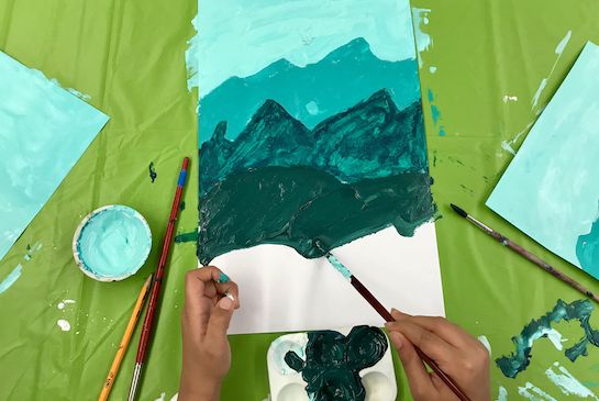
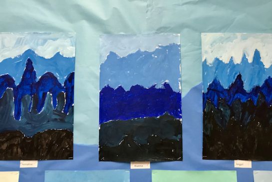
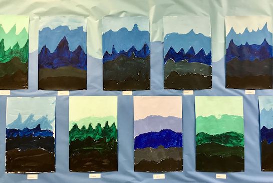
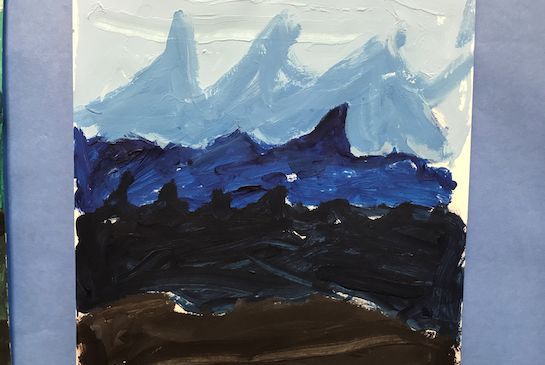
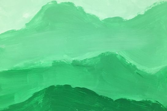
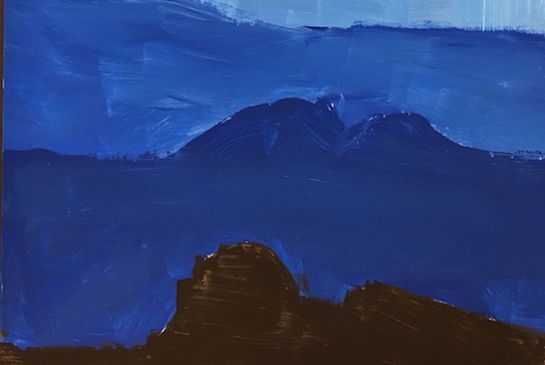
- The sky and two mountain ranges will be TINTS of the hue. The midground will be the pure color hue. The foreground just below the Hue/midground will be a shade of the hue. The foreground nearest the viewer/first mountain range will be BLACK or a VERY DARK shade with only a hint of the hue.
- Each color change should contrast enough to be distinct.
Discussion Points:
How do landscapes appear in nature? Have students ever noticed how mountains that are farther away appear to be a lighter shade?
Talk about perspective, how things appear smaller the farther away from you they are. Things look less distinct, or less crisp in the details.
Refer to Hues/Shades/Tints Reference Materials and talk about how various famous artists have used these techniques in their paintings.
Instructions for Lesson:
- Instruct the student to write their name on the back of the paper and orient paper in portrait format.
- Find the approximate middle of the page. Make a small tick mark with pencil. This is the midground.
- Begin at the bottom or lower 6th of the paper to sketch your first mountain range in the foreground. (Docent: This is the foreground and will be black or a very dark shade value.)
- Move pencil up on the paper (BUT BELOW MID-POINT) to draw second mountain range.
- Move pencil up the paper to the approximate midpoint of the page and draw your midground mountain range. (Approximate middle will be more visually interesting than an EXACT middle. This is the midground/hue value.)
- Move the pencil up the paper to draw the first background mountain range. (This will be a tint value.)
- Move pencil up the paper to draw the last background mountain range. (This will be a tint value.)
- (Docent: Pick-up pencils. Distribute white paint, one brush, and pure hue paint.)
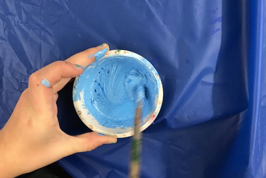
- Take a small amount of hue paint onto the tip edges of the brush and mix into the white paint. The color should be very subtle. The value is defined as very LIGHT.
- Use this tint to paint the sky.
- Take the brush and mix more hue into the tint paint pot to create the color for the farthest mountain range.
- Paint the farthest mountain range in the background with this tint.
- Take the brush and mix MORE hue into the tint paint pot to create the color for the next closest mountain range.
- Paint the next mountain range in the background with this tint.
- Get a new clean brush to paint the pure hue in the midground.
- Using this brush add an amount of black paint to the pure hue to that you can see a contrast from the hue color.
- Paint this shade in your foreground mountain range.
- Clean your brush with a paper towel. Use the black or black with some hue added to paint the first—bottom most—foreground. If the paint has dried enough students may be able to paint a tree in the foreground.
Reflection Points (Assessment of Learning Objectives):
- Student demonstrates an understanding that things closest to the viewer appear darker and more distinct in a work of art than objects in the distance. Shades in the foreground. Hue in the midground. Tints in the background.
- Student demonstrates color mixing of tints and shades.
- Student can differentiate a tint from a shade.
References & Attributions
Images from Issaquah Valley Elementary 4th Grade class. Lesson written by Angie Warren.
Notes For Educators
21st Century Thinking Skills
Sequencing (creating order), Comparing/Contrasting, Questioning, and Reflecting.
WA State Learning Standards
(VA: Cr2.1.4) Organize and develop artistic ideas and work. Explore and invent art-making techniques and approaches. Experiment with techniques and processes.
(VA: Cr3.1.4) Refine and complete artistic work. Revise artwork in progress on the basis of insights gained through peer discussion or self-reflection.
(VA: Re9.1.4) Apply criteria to evaluate artistic work. Apply one set of criteria to evaluate more than one work of art.
Arts Integration Opportunities
Language Arts/Storytelling.
Science: the study of weather and atmosphere.
Please note: These lesson plans are intended for non-profit use only. Use of these plans for commercial purposes should give attribution to the Issaquah Schools Foundation and be accompanied by a nominal donation at www.isfdn.org/donate. Thank you.
Donate Now