Line: the flat path of a dot through space used by artists to control the viewer’s eye movement; a long narrow mark or stroke made on or in a surface; a thin mark made by a pencil, pen, or brush.
Texture: the surface quality that can be seen and/or felt. Texture can also be implied, i.e. it looks bumpy but feels smooth.
Balance/Symmetry: the arrangement of elements that makes individual parts of a composition appear equally important; an arrangement of the elements to create an equal distribution of visual weight throughout the format or composition.
Contrast: the difference between elements of art (geometric lines vs. organic shapes in this case) such that each element is stronger in relation to the other.
Movement: using the element to move the viewer’s eye around and within the image.
Pattern: the repetition of an element throughout the work of art.
Rhythm: created by repetition of elements in a non-uniform but an organized way. Unlike pattern, which demands consistency, rhythm relies on variety.
Unity: a principle of art; a successful combination of the elements of visual arts to create a sense of wholeness and visual completion in an artwork.
Asymmetrical Balance (informal balance): the type of balance that results when two sides of an artwork are equally important, but one side looks different from the other.
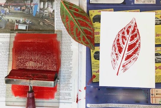
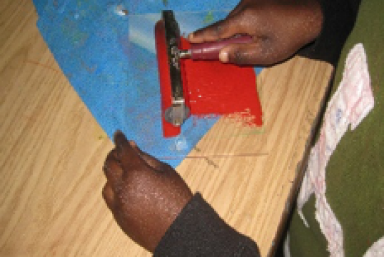
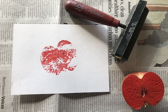
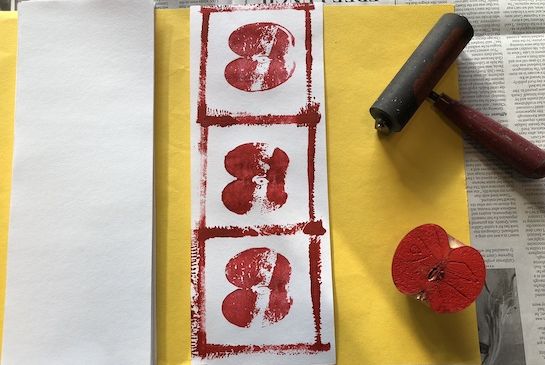
Brayer: a handled roller for applying ink to a surface.
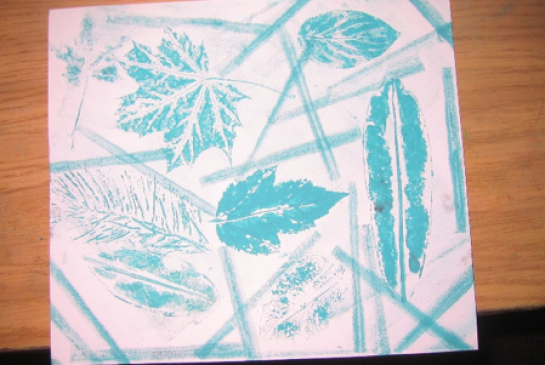
Composition: the way the elements (shapes, lines, colors) are arranged, using principles of design, on the paper to create unity/variety.
Master, print: prints are copies of a master image. The intensive work on one master means many prints can be made quickly.
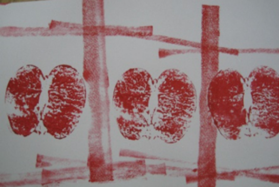
Relief Printing: ink is applied to a surface which is then pressed on paper. The recessed areas which aren’t inked (space between and around the leaf, in this case) don’t print.
Botanical drawings, natural science, printing press type. Hokusai carved woodblocks to create areas of relief.
Set out Plexiglas, brayers, pencils and paper towels at desks (OK for 2 students to share). Stack white paper either in the center of a group table or on another table to keep it clean. Keep leaves or other natural objects in a clean place.
Students will talk about what a print is: a copy of an original master, either a document or picture. Before electronic reproduction, artists used a variety of methods. Today you will be using raised relief printing, and a natural object will be the master. Ask them to think about fingerprints, footprints, handprints, and stamps etc. Remind them there is a raised section that the ink is applied to. The space around the raised sections where the color is applied remains clean so it doesn’t transfer color to the printed surface.
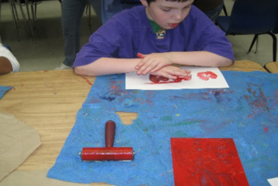
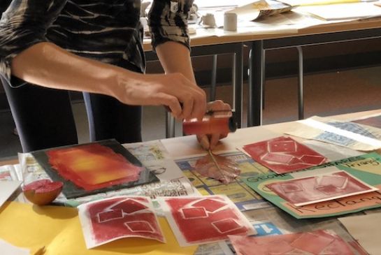
Students will use the brayers to apply ink to a leaf and print it clearly, arranging the printed shapes in a visually interesting composition that contains unity and variety. Students will use good craftsmanship: avoiding sloppy application of ink, smeared prints, empty space.
Ask students to try rolling the brayers across the clean plexiglass sheets and then onto the table top. Then demonstrate the following:
The J. Paul Getty Museum, elements of art reference page.
21st Century Thinking Skills
Observing, making connections, visualizing (when placing), sequencing (steps to make the pint), comparing/contrasting (how their efforts affect each print), finding evidence, problem solving, cause and effect.
WA State Learning Standards
(VA:Cr1.2.4) a. Collaboratively set goals and create artwork that is meaningful and has purpose to the makers. When students create their composition and choose the objects to print it creates meaning.
(VA:Cr2.1.4) a. Explore and invent art-making techniques and approaches.
(VA:Cr2.2.4) a. When making works of art, utilize and care for materials, tools, and equipment in a manner that prevents danger to oneself and others.
(VA:Cr3.1.4) a. Revise artwork in progress on the basis of insights gained through peer discussion. This happens if you talk about what is happening/why during the printing process.
(VA:Pr4.1.4) a. Analyze how past, present, and emerging technologies have impacted the preservation and presentation of artwork. This happens if you discuss past and present ways to make a print.
(VA:Re9.1.4) a. Apply one set of criteria to evaluate more than one work of art. This happens if you are looking for unity/variety in each student’s work.
Arts Integration Opportunities
Any natural science topic can be enriched. Eg. Johnny Appleseed, vascular systems of leaves. Using a second color of ink (primary, metallic, black or white) can introduce tints, shades, secondary colors. Gyotaku is the Japanese art of fish printing. If studying fish, you could try this.
Please note: These lesson plans are intended for non-profit use only. Use of these plans for commercial purposes should give attribution to the Issaquah Schools Foundation and be accompanied by a nominal donation at www.isfdn.org/donate. Thank you.
Fueling Success for Every Student, Every School