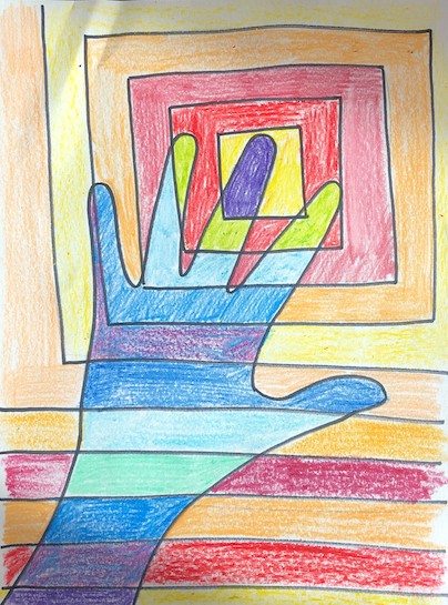
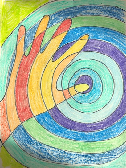
Color: Light reflected off objects. Complementary colors are directly opposite each other in the color spectrum: red/green, blue/orange, yellow/purple. These pairs contain all 3 primary colors. Complementary are the most highly contrasting color pairs. Cool Colors are colors on the color wheel associated with coolness: blue, green, and violet (they appear to recede in space).Warm Colors are colors on the color wheel associated with warmth: red, yellow, and orange. (they appear to advance in space).
Line: a long narrow mark or stroke made on or in a surface.
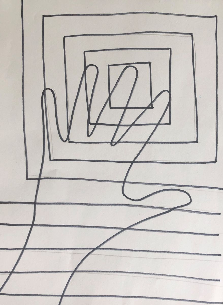
Shape: a closed line. Shapes can be geometric or organic. They are flat, express height and width.
Contrast: Complementary colors are the most highly contrasting colors on the color wheel. Contrast between elements attracts the eye and creates interest.
Emphasis (Focal Point): The area of a composition which is visually dominant.
Color Wheel: a tool in which colors are arranged in a specific order in a circle; used to explain color theory and show how colors relate to one another.
Composition: using principles of design to arrange elements of art to create art; the way elements are combined to express a particular idea.
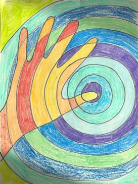
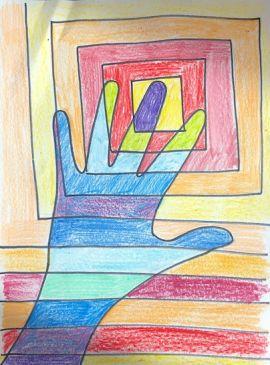
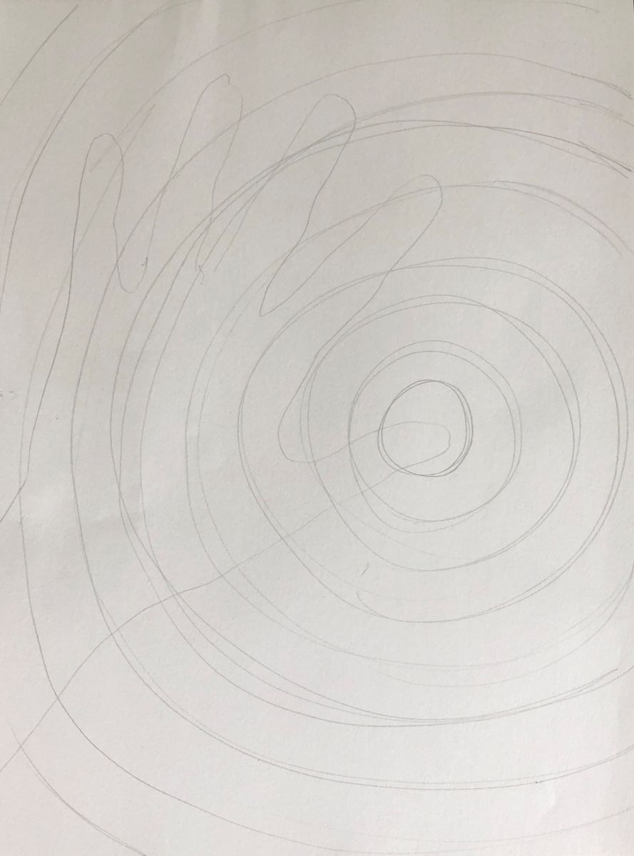
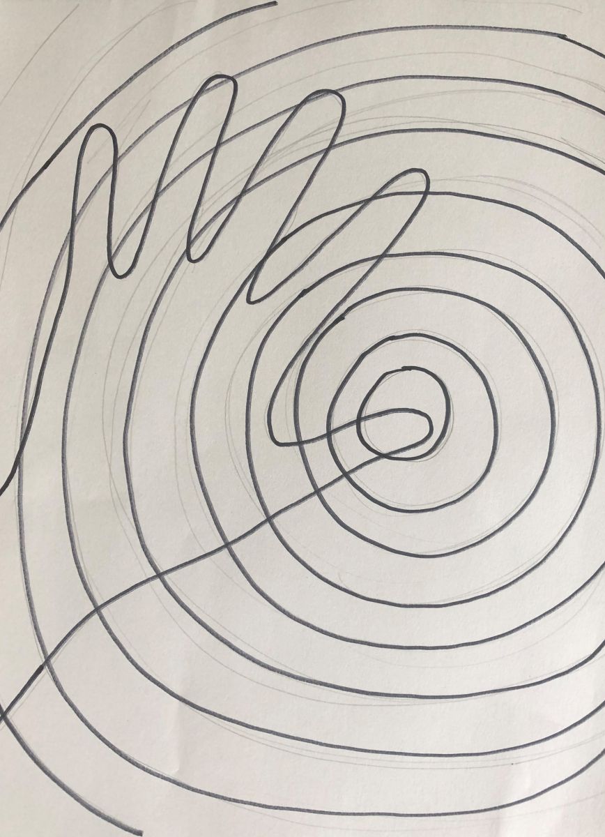
Concentric: circles, arcs, or other shapes which share the same center, the larger often completely surrounding the smaller.
Craftsmanship: A way of working that includes following directions, neatness and proper use of tools.
Find examples of complementary colors in art – Images below are examples.
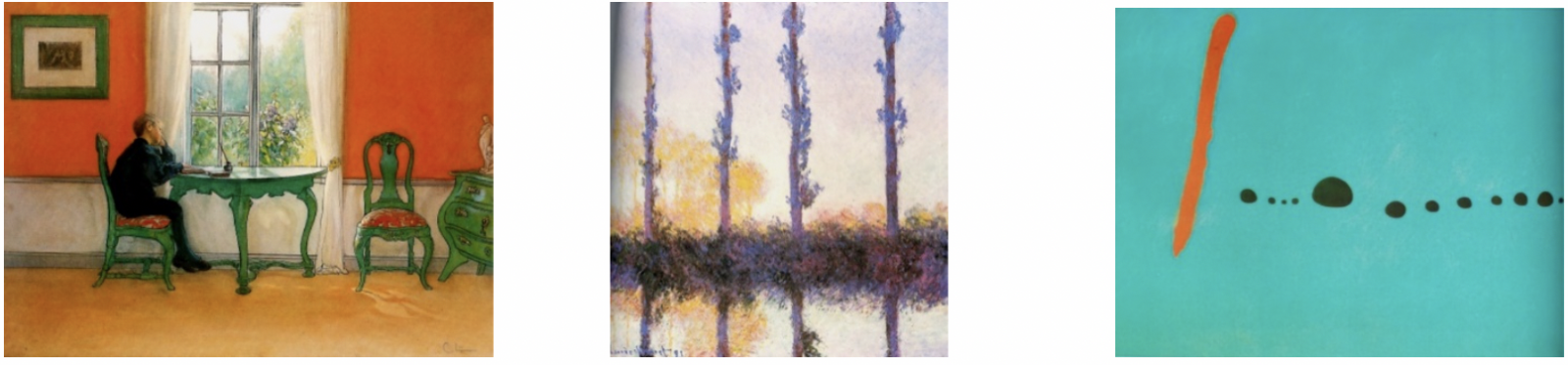
Images left to right: Lessons by Larsson (Swedish), 1898 red/green; Poplars by Monet (French), 1891 purple/yellow; Blue II by Miro (Spanish), 1961 orange/blue.
Students will:
Hand out a color wheel worksheet and white construction paper.
.jpg)
Lesson written by Juliette Ripley-Dunkelberger.
21st Century Thinking Skills
Thinking flexibly, persisting, questioning, creating, innovating, listening with empathy, taking responsible risks, observing, making connections, visualizing, sequencing, predicting, comparing/contrasting, determining main idea, finding evidence, problem solving, cause and effect, determining point of view, decision making.
WA State Learning Standards
(VA:Cr1.2.2) a. Make art or design with various materials and tools to explore personal interests, questions, and curiosity.
(VA:Cr2.1.2) a. Experiment with various materials and tools to explore personal interests in a work of art or design.
(VA:Cr2.2.2) a. Demonstrate safe procedures for using and cleaning art tools, equipment, and studio spaces.
(VA:Cr3.1.2) a. Discuss and reflect with peers about choices made in creating artwork. This happens if you share student choices as they work.
(VA:Re7.1.2) a. Perceive and describe aesthetic characteristics of one’s natural world and constructed environments.
(VA:Re8.1.2) a. Interpret art by identifying the mood suggested by a work of art and describing relevant subject matter and characteristics of form. This happens when you break down the elements and principles’ functions in a good design.
(VA:Re9.1.2) a. Use learned art vocabulary to express preferences about artwork.
Please note: These lesson plans are intended for non-profit use only. Use of these plans for commercial purposes should give attribution to the Issaquah Schools Foundation and be accompanied by a nominal donation at www.isfdn.org/donate. Thank you.
Fueling Success for Every Student, Every School