loading Skip to Main Content

Warm and Cool Hearts

Students will use contrasting colors to create emphasis from a simple symbol in the style of Jim Dine. Recommended for 3rd Graders.

Elements of Art

Color: the visible range of reflected light. Color has three properties: hue (its name), value (light or darkness), and intensity (the brightness/dullness). 
--Color schemes: groupings of colors that are related on the color wheel.
--Analogous: next to each other on the color wheel and very similar.
--Complementary: colors opposite each other on the color wheel which add interest when used next to each other. 
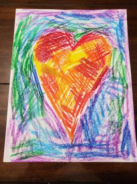
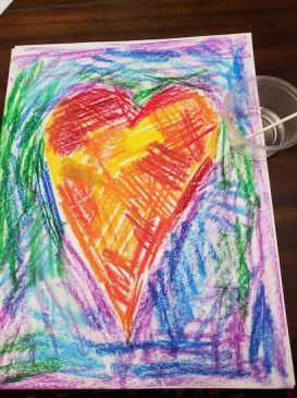
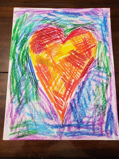
--Cool Colors: colors on the color wheel associated with coolness: blue, green, and violet. 
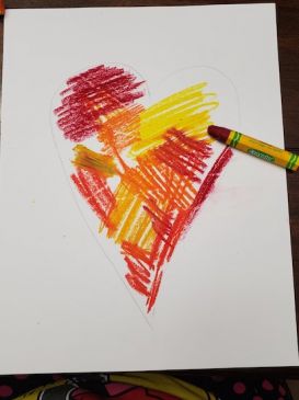
--Warm Colors: colors on the color wheel associated with warmth: red, yellow, and orange.
warm colors are red, orange, and yellow. Cool colors are blue, green, and purple.
Shape: a two-dimensional (flat) area enclosed by a line.

Principles of Design

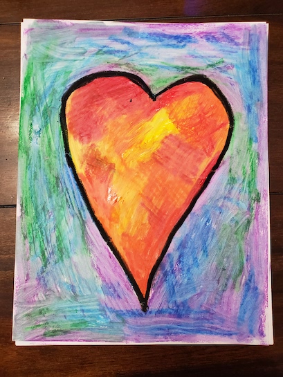
Contrast: refers to the arrangement of opposite elements, or using opposite qualities next to each other to create visual interest, excitement and drama.  This lesson contrasts the color of the heart against its complimentary-colored background.
Emphasis (focal point): the part of an artwork that is emphasized in some way and attracts the eye and attention of the viewer; also called the center of interest.

Additional Vocabulary

Color Wheel: a tool in which colors are arranged in a specific order in a circle; used to explain color theory and show how colors relate to one another.

Materials & Supplies

  • Thick drawing paper or watercolor Paper, 9x12”
  • Ruler
  • Pencil
  • Eraser
  • Small Square of Yellow Paper
  • Larger Piece of Blue Paper
  • Larger Piece of Yellow Paper (the same size as the small square)
  • Oil Pastels
  • Colored construction paper
  • Baby Oil
  • Cotton Swabs

Context (History and/or Artists)

Jim Dine:  Jim Dine was born (1935) in Cincinnati, Ohio.  His family owned a hardware store and he developed a respect for everyday objects.  This influence is evident with his use of everyday objects in his art.  Sometimes he attached the actual tools or clothing to his canvases.  Once he even attached a kitchen sink!  Jim Dine loves the power of simple images.  His graphic style and bold colors are closely associated with pop art, although he doesn’t consider himself a pop artist.
Pop Art:  an art movement that emerged in the 1950s and flourished in the 1960s in America and Britain, drawing inspiration from sources in popular and commercial culture. Different cultures and countries contributed to the movement during the 1960s and 70s.

Advanced Preparation

Prepare heart templates, if using.
Put only enough baby oil in cups to coat the bottom of the cup.

Tips & Tricks 

  • Do not let the students use too much baby oil. 
  • Have the students take out only warm color oil pastels when they are using warm colors or vice versa for cool colors. Leave the rest in the box.
  • Depending on time and disposition of the class, heart templates could be used instead of drawing the heart.  
  • If using heart templates, consider giving the students the option of tilting the template to give some variety.

Discussion Points

Using images of Dine’s work, discuss how emphasis in artwork is used.
Review complementary and warm and cool colors and how they create contrast.

Reflection Point (Assessment of Learning Objectives)

Students will:

  • use contrasting colors to create a focal point from a simple symbol in the style of Jim Dine.
  •  They will use color to create contrast.
  •  They will view art by Jim Dine.

Instructions for Lesson

  1. Display some heart paintings by Jim Dine.  End with one that is made of warm colors and the background cool colors, such as The Hand-Colored Viennese Hearts III or A Heart on the Rue Granelle. Point out how these colors fall on the color wheel and can be complementary.
  2. Ask the students why the heart is the first thing they see in the picture? (Point of emphasis.)  Why? (size, location, contrasting color compared to the background) How would this painting feel different if it had a tiny heart in the corner rather than a large heart?  
  3. Hold up a small yellow square on top of a larger square of the same color.  Next, hold up the same small yellow square on a larger square of purple and have the students observe the difference or contrast.
  4. Reference the students back to Jim Dine’s artwork.  What if the heart was the same color as the background?  Why do you think Jim Dine chose to make it different?
  5. Explain warm and cool colors.  Write a list of warm colors and cool colors.  Have the students notice how the artwork uses warm and cool colors to create contrast and draw our eyes right to the heart. Find which warm colors are complementary to which cool colors on the color wheel.
  6. Explain emphasis that students will create their own art with a large heart as the point of emphasis.
  7. Demonstrate before students begin. Position the paper vertically.
  8. Optional – Drawing the Heart (If using heart templates or stencils then skip number 8 through 10) 
    1. Instruct the students to lightly draw a vertical line down the center of the paper using a ruler.  
    2. Lightly draw a horizontal line in the middle of the paper using a ruler.  This should create a “plus” sign in the middle of the paper.  
    3. Demonstrate and then direct the students to draw a large heart covering most of the paper.  Draw grid by grid, letting students copy you as you go.
    4. Have them put their pencils on the vertical line a little higher than the center. 
    5. Lightly draw up at a diagonal, then curve around and draw a diagonal line straight down but stop in the midline of the page.  
    6. Repeat on the opposite side “up, curve around then diagonal down”. 
    7. Emphasize that it is okay for the students’ hearts to be asymmetrical or imperfect.  It adds personality!
    8. Erase the “plus sign” but leave the heart.  
    9. Variation: Leave the lines and use them to create quadrants of warm or cool color combinations. Different color combos in each of the four quadrants.
  9. Place the heart template in the center and trace to create the heart.
  10. Remind the students about warm and cool colors and have them decide if they want a warm heart or cool heart. 
  11. Demonstrate how to color in the heart with patches of color using loose, quick strokes.  Color back and forth with quick strokes to make a patch of color.  Repeat in a different direction with a different color (still warm or cool color, whatever has been chosen).  The colors can overlap or even be colored right on top of each other.  Gaps in the coloring are fine.
  12. Students will color inside the heart using their chosen warm or cool colors, using the coloring technique demonstrated.  
  13. Next, the background is colored, using the same quick stroke technique.  If the student colored in a warm-colored heart, then the background will be colored in using cool colors.  
  14. Lightly dab a cotton swab in baby oil.  Use it to blend the colors inside the heart.  Start with the light colors first.

  15. Discard that cotton swab.  Use a new cotton swab dipped in a little baby oil to blend the background.
  16. Slowly outline the heart with black oil pastel

References and Attributions

Lesson written by Rachelle Roberts. Project Inspired by “Jim Dine Inspired Warm & Cool Hearts” by Heidi Furman from Newcastle Elementary. “Jim Dine Art, Bio, Ideas.” The Art Story. Tate. “Pop Art – Art Term.” Tate.

Notes for Educators

21st Century Thinking Skills
Observing, Making Connections, Visualizing, Comparing/contrasting, Finding Evidence, Decision Making, Evaluating.

WA State Learning Standards
(VA:Cr1.1.3) a. Elaborate on an imaginative idea.
(VA:Cr2.2.3) a. Demonstrate an understanding of the safe and proficient use of materials, tools, and equipment for a variety of artistic processes. 
(VA:Re7.1.3) a. Speculate about processes an artist uses to create a work of art. 
(VA:Re7.2.3) a. Determine messages communicated by an image:  This happens if you talk about the meaning of the heart image.
(VA:Re9.1.3) a. Evaluate an artwork based on given criteria.
(VA:Cn11.1.3) a. Recognize that responses to art change depending on knowledge of the time and place in which it was made.

Please note:  These lesson plans are intended for non-profit use only. Use of these plans for commercial purposes should give attribution to the Issaquah Schools Foundation and be accompanied by a nominal donation at www.isfdn.org/donate. Thank you.

Donate Now

Artistic Support Reference Materials

Loading...
Loading

Fueling Success for Every Student, Every School