Context (History and/or Artists)
Students will use the images to ascertain how light and shadow define the contours of the simple form. They will then use color to recreate the form in their own drawings. Light travels in a straight line and as it shines on a form it is affected by surfaces turning away from the light.
Learn more about drawing HERE.
Advanced Preparation
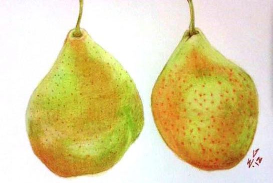
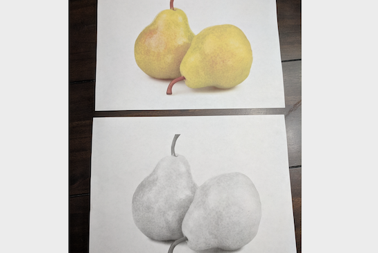
Choose a simple form’s (ball, pear, apple, strawberry, green pepper, cup) image. It may or may not be related to a current subject of study in the other classes. Make one color and one black and white copy of the image for each student.
Discussion Points
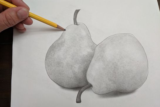
- Using an overhead projector, point out the way light and shadow define the form in the black and white image. Explain that the shades of gray that appear between the lightest and darkest areas are where the light is indirectly hitting the object. This can be drawn by lightening the pressure of a pencil on the paper gradually. Students may try this on a piece of scrap paper to view the way shading controlled.
- Switch to the colored image and remark at the way the colors vary in response to the same ‘shadows.’ Look for these colors on the color wheel, especially if they change to the colors lying immediately next to each other: e.g. red changes to red-orange, changes to orange, changes to orange-yellow, etc.
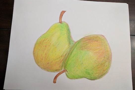
- Show at least one image of Paul Cezanne’s fruit still life paintings.
Tips & Tricks
- Always let lines’ strokes follow the contour of the object. Keep in mind that every stroke will show in the final product.
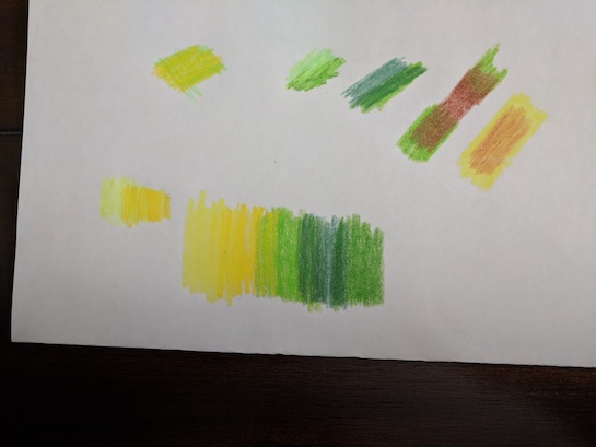
- Create a color swatch on a spare sheet. This is a great learning tool, to test various color combinations. Use colors that are next to each other on the color wheel. Overlap each color slightly to create a smooth blended transition. Try using varying pressure to test what works.
- When applying color, start with the lightest color and progress to the darker ones.
- Use the white of the paper as the ‘highlight.’
- A sharp point on a pencil turned on its side (parallel to the paper) creates a smoother texture, as it gets into all the paper’s grooves.
- A blunt point is used for a rough fill-in because it skips the valleys, and stays only on the top surface.
- Hold the pencil perpendicular to the paper for sharper lines.
- Impressed lines, or indentations, can be used for creating special effects like the sunken seeds in strawberries, or the veins in a leaf.
- Hand held sharpeners let you control the sharpness of the pencil based on your need.
Instructions for Lesson (using colored pencils)
(see below for modifications for oil pastel)
- Hand out all supplies.
- Have the students secure the black and white copy of the image, wrong side up, on the clipboard.
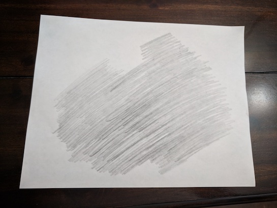
- Demonstrate how to cover the back of the paper with an even layer of graphite, using the 2B pencil. Hold the sharpened pencil on the side parallel to the paper and shade evenly.
- Remove this paper, and secure the drawing paper onto the clipboard.
- Center the black and white image over the paper, right side up and secure on the clipboard.
- Trace along the contours of the image with the point of the graphite pencil.
- Trace the contours of the bright spots and the dark areas as well. This will transfer the image.
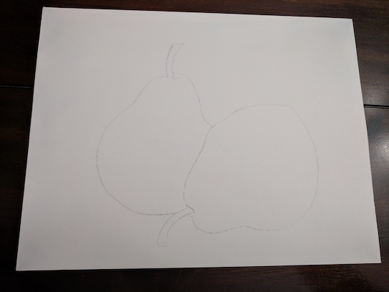
- Before removing the black and white image, make sure all the details have been captured on the drawing paper.
- Have students do this. Supervise their progress and help when needed.
- Fold the black and white image in half with the graphite on the inside to keep from getting messy.
- Have students color test all of their pencils so they know what colors they have. Using scrap paper, practice creating an even tone. Apply color in small, curved strokes with light pressure. Again, use a sharpened colored pencil turned on its side. Use this for all the layers of color.
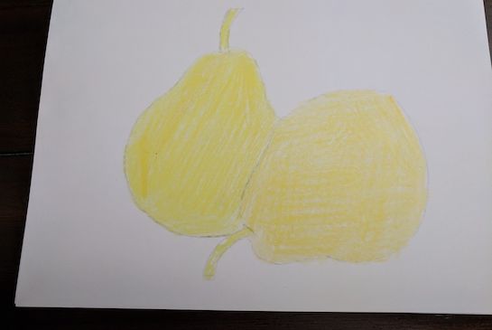
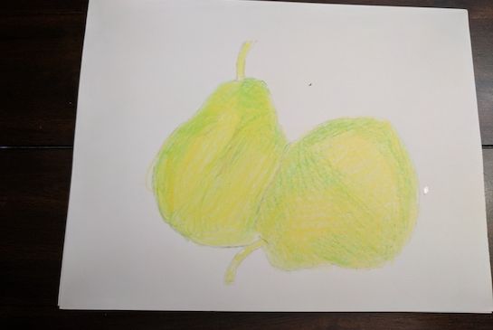
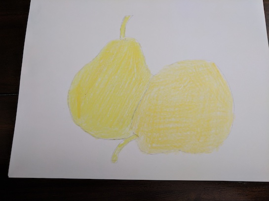
- Return to the drawing. Demonstrate how to apply an under-layer of yellow throughout the fruit, and the stems. It will create a healthy glow. It also unites all the elements in the image. Use this vocabulary while demonstrating. Tip: when applying color, always follow the contours of the object to create a more 3-dimensional rendition, a commonly used technique when drawing.
- Have students do the same, blending the strokes with the fingers.
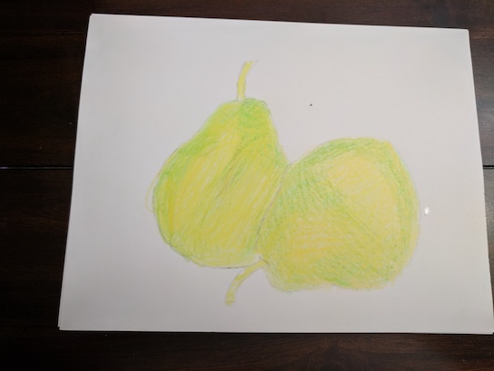
- Demonstrate how to apply light green over most of the fruit, except a few highlights on the shiniest parts of the fruit. Keep these highlights color free until the very end. Again, follow the contours of the fruit from the center core to the outer edges.
- Demonstrate applying each new color alternating with giving students time to do the same. Dark green should be applied to the areas that are in the shadows and towards the edges to create depth.
- Layer orange, followed by red, in the darker parts of the fruit.
- Use brown, sharpened to a fine tip, to create the spots on the fruit.
- In the stem use dark green, and brown, applied at an angle, to give it roundness.
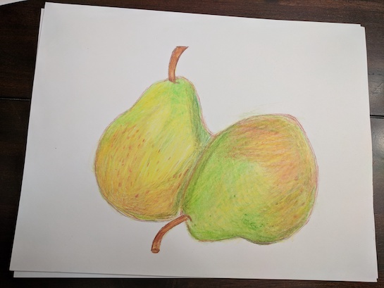
- Use black sparingly: at the tip and base of the stem and along the outer edge that casts a shadow.
- Apply a top layer of yellow to blend all the colors together.
- Start again layering color to create depth.
- When the time is up or when students are satisfied with their work it is time to stop.
- Erase stray marks, sign the artwork and frame it.
Modification for Using Oil Pastel
- As each color is applied, make it blend with its neighbor, so that it’s going from tint-hue-shade with a gradual gradation and no ‘stripes’. This requires each section to blend seamlessly. Oil pastel softens & blends with gentle rubbing. Model this by applying a light layer of color, turning the oil pastel on its side. It may be necessary to peel the paper off the pastel first.
- Smaller details should be done with the point of the pastel and don’t need to blend.
- Note: Oil pastels lines are thicker than pencil lines. Adjust the strokes accordingly. Don’t expect finely-drawn details to show up well.
Reflection Point (Assessment of Learning Objectives)
- Students will use colored pencils or oil pastels to apply layers of color following the contour of the object to create depth and a 3D form on paper.
- They will hear and use correct vocabulary when describing the elements and principles used.
References and Attributions
Lesson written by Ekta Gupta.
Notes for Educators
21st Century Thinking Skills
Thinking flexibly, Creating, Observing, Making Connections, Visualizing, Sequencing, Comparing/Contrasting, Finding Evidence, Determining Point of View, Evaluating.
WA State Learning Standards
(VA:Cr1.2.4) Collaboratively set goals and create artwork that is meaningful and has purpose to the makers.
(VA:Re9.1.4) Apply one set of criteria to evaluate more than one work of art.
(VA:Cr2.1.5) Experiment and develop skills in multiple art-making techniques and approaches through practice.
(VA:Cr2.2.5) Demonstrate quality craftsmanship through care for and use of materials, tools, and equipment.
(VA:Cr3.1.5) Create artist statements using art vocabulary to describe personal choices in art-making. This happens when students use art vocabulary in a question/answer setting/. (VA:Re7.1.5) a. Compare one's own interpretation of a work of art with the interpretation of others.
(VA:Re8.1.5) Interpret art by analyzing characteristics of form and structure, contextual information, subject matter, visual elements, and use of media to identify ideas and mood conveyed. This happens when viewing Cezanne’s use of color to create form.
(VA:Cn10.1.5) Apply formal and conceptual vocabularies of art and design to view surroundings in new ways through art-making.
Arts Integration Opportunities
Science: Study of light.
Please note: These lesson plans are intended for non-profit use only. Use of these plans for commercial purposes should give attribution to the Issaquah Schools Foundation and be accompanied by a nominal donation at www.isfdn.org/donate. Thank you.
Donate Now