Space: the element of visual art that describes the area above, below, around and within art. Positive/Negative Space: Positive space is the actual space taken up by a line, shape, or form. Negative Space is the empty space surrounding a shape, figure, or form in a 2- or 3-dimensional artwork. It also refers to an illusion of depth on a 2-dimensional (height and width) surface, so that the scene appears to go back into space.
Texture: how the surface feels or appears to feel.
Value (Hue/Shade/Tint): Color that’s modified from its pure hue to darker (shade) by adding black or lighter (tint) by adding white. When using transparent watercolor paint, tints are achieved by adding water so that the white of the paper shows through.
Proportion: a principle of design; the relationship of parts to a whole or parts to one another in regard to size and placement.
Background: in a landscape, the area “farthest away” from the viewer, higher on the paper, and contains few details and is often hazy like sky.
Depth: the apparent distance from front-to-back/ near-to-far (low-to-high on the paper) in an artwork; the 3rd dimension that gives objects form (besides height and width).
Horizon line: the horizontal line that delineates the sky from the land/water.
Foreground: the area “closest to” the viewer, lowest on the paper, containing the crispest details.
Layering: overlapping shapes to imply depth.
Mid-Ground: the space between the foreground and background.
Perspective: the art of drawing on a 2-dimensional surface so as to give the accurate impression of height, width, depth and position in relation to each other when viewed from a particular viewpoint.
Wash: the application of water to the paper, to which a small amount of paint is added that creates a light background or “atmosphere” to the work.
Paper towels
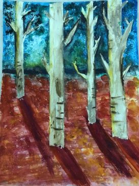
Albert Bierstadt was born in Germany in 1830 and moved to America with his family at age 2. He knew from an early age that he wanted to be a painter, and when he was 23, he moved back to Germany to study art. In 1859, back in the United States, he traveled to Colorado and Wyoming with the U.S. Government survey expedition. This is when he discovered and began to paint the breathtaking western landscapes for which he is famous. Without cameras, it was important to document the newly discovered continent as accurately as possible for people back east, and using perspective techniques helped accurately recreate the landscapes he saw.
Students will:
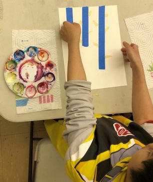
- Orient the paper vertically.
- 1/3 up the paper from the bottom, demonstrate first and then have students lightly draw a horizon line with the pencils. The higher the horizon line, the less sky, more land in the picture plane. It’s good to let students make that design choice, but no higher than ½ way up. The more sky, the more color!
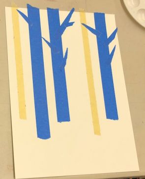
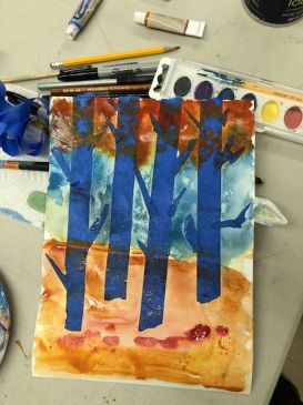
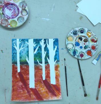
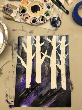
- Starting from the horizon line and moving to the bottom of the paper, demonstrate first by arranging the torn tape on the paper to create trees: small trees in back and larger trees in front. Trees must be placed from small to large; from nearest the horizon line to farthest; and the nearest trees may overlap. The ones in the very front can have branches that overlap the others. Vary the distance between trees.
- Rub the edges of the tape down well to make sure water doesn’t leak underneath..JPG)
.JPG)
.JPG)

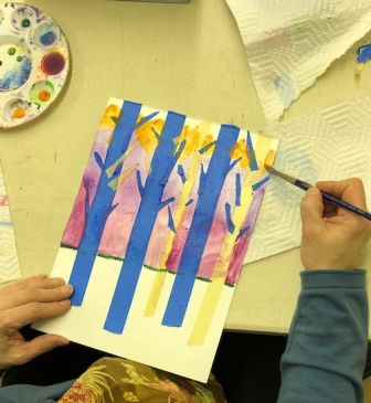
- This can also be done with “sunset” or warm colors. Lay the red near the horizon and add yellow to the brush as you paint upwards. Add water whenever paint doesn’t move and blend freely. Or when color is too heavy.
- Don’t clean the brush between the hue, as this helps the colors mix. Keep a paper towel near the water cup to catch random water drops or over-filled brushes. Students will develop a knack of maintaining the water/color ratio using the paper towel!
- Once done, rinse the brush and dab on the paper towel.
- Demonstrate for students how to add pinches of salt, gently sifted between the fingers, to their work to simulate snow falling. Explain that the salt absorbs wet color and will be removed from the paper when dry..JPG)

Have students complete the bark.
- On the palette, add more water to the brown paint to make a lighter color.
- Think about where the light is coming from and put a finger of the non-dominant hand wherever that is in the sky.
- Using the small brush create a tree shadow that comes from the base of the tree downward (diagonally) away from the finger.
- All the shadows should go the same direction as the light source is the same for all the trees. Caution against accidentally painting that shadow across other trees!.JPG)
Lesson written by Juliette Ripley-Dunkelberger & Naveen Khan; Albert Bierstadt website.
21st Century Thinking Skills
Thinking flexibly, persisting, creating, taking responsible risks, reflecting, observing, making connections, visualizing, sequencing, comparing/contrasting, determining main idea, finding evidence, problem solving, determining point of view, cause and effect, decision making, evaluating.
WA State Learning Standards
(VA:Cr1.2.5) a. Identify and demonstrate diverse methods of artistic investigation to choose an approach for beginning a work of art. This happens if it’s understood that watercolor effects work well to suggest color-filled skies.
(VA:Cr2.1.5) a. Experiment and develop skills in multiple art-making techniques and approaches through practice.
(VA:Cr2.2.5) a. Demonstrate quality craftsmanship through care for and use of materials, tools, and equipment.
(VA:Cr3.1.5) a. Create artist statements using art vocabulary to describe personal choices in art-making. This happens if students share during the lesson.
(VA:Pr5.1.5) a. Develop a logical argument for safe and effective use of materials and techniques for preparing and presenting artwork.
(VA:Re8.1.5) a. Interpret art by analyzing characteristics of form and structure, contextual information, subject matter, visual elements, and use of media to identify ideas and mood conveyed. This happens when perspective drawing techniques are used to create 3-dimensional depth. How does Bierstadt’s painting look so real?
(VA:Re9.1.5) a. Recognize differences in criteria used to evaluate works of art depending on styles, genres, and media as well as historical and cultural contexts. Realistic art was particularly useful in the pre-camera era.
(VA:Cn10.1.5) a. Apply formal and conceptual vocabularies of art and design to view surroundings in new ways through art-making.
Arts Integration Opportunities
Procedural writing: students can write down the steps they used to make this painting, as if they were explaining the process to an absent student.
Poetry or creative writing: write a poem or tell a story that the painting illustrates.
Please note: These lesson plans are intended for non-profit use only. Use of these plans for commercial purposes should give attribution to the Issaquah Schools Foundation and be accompanied by a nominal donation at www.isfdn.org/donate. Thank you.
Fueling Success for Every Student, Every School